A Pantry We Love (Project Feature)
I can’t believe I’ve never shared this project with you on the blog! At least not in all its glory – I briefly mentioned it a year ago in my Spaces We Love blog, but it’s truly one of my favorites and deserves a full spread!
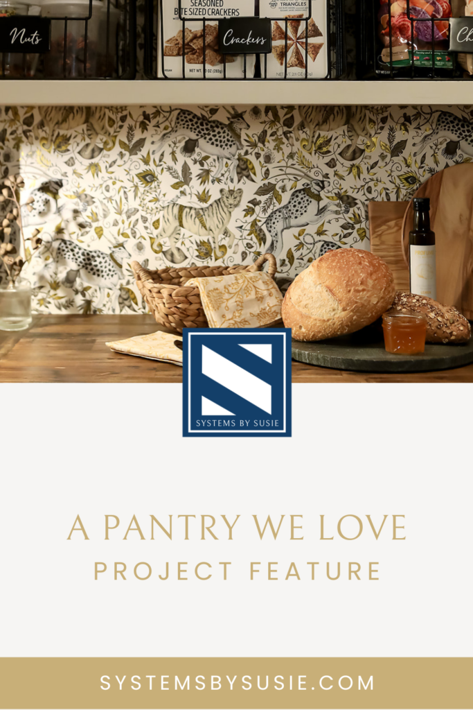
In this project, we got to work with our good friends over at Dream House Studios to create a gorgeous pantry space for owner Kim Mohr. Kim and I have worked together on so many projects for clients, so getting her pantry just the way she wanted it was a special treat.
Late last year we had the opportunity to get it professionally photographed by Lee Kriel, who captures our work so beautifully. Enjoy the photos and get inspired!
The Before
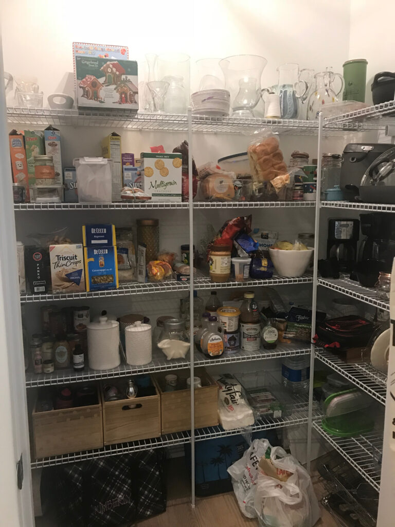
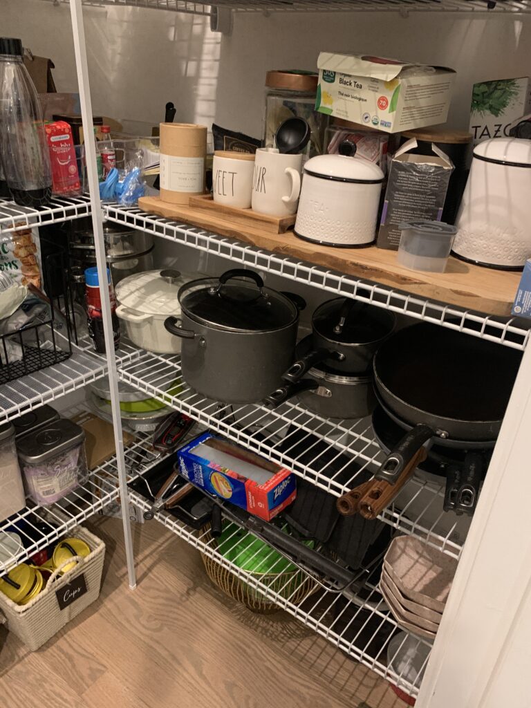
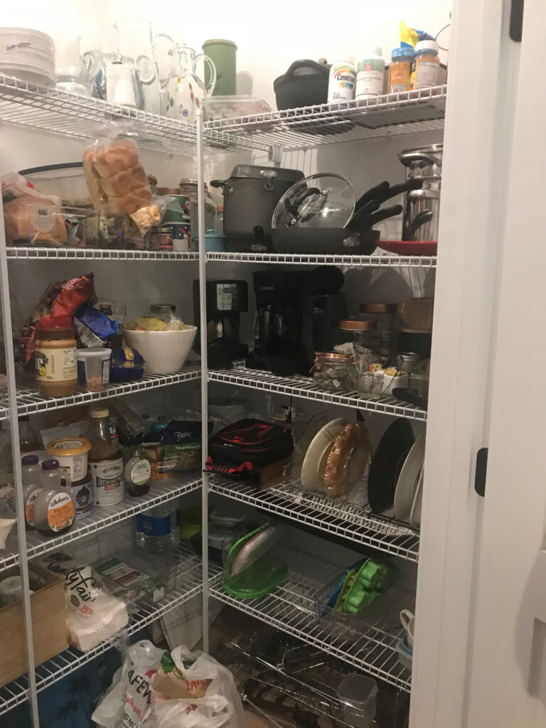
When we first began working with Kim on this project back in 2019, her pantry looked a little different! It was a good size, but builder-basic with wire shelving, which can be really hard to work with. Kim had added some longer cutting boards to the surface to make it a bit more stable.
Phase 1
Kim knew that she would eventually be remodeling her pantry, but the first time we worked together the goal was to make the current setup work as is. Here are some photos from after we organized in 2019.
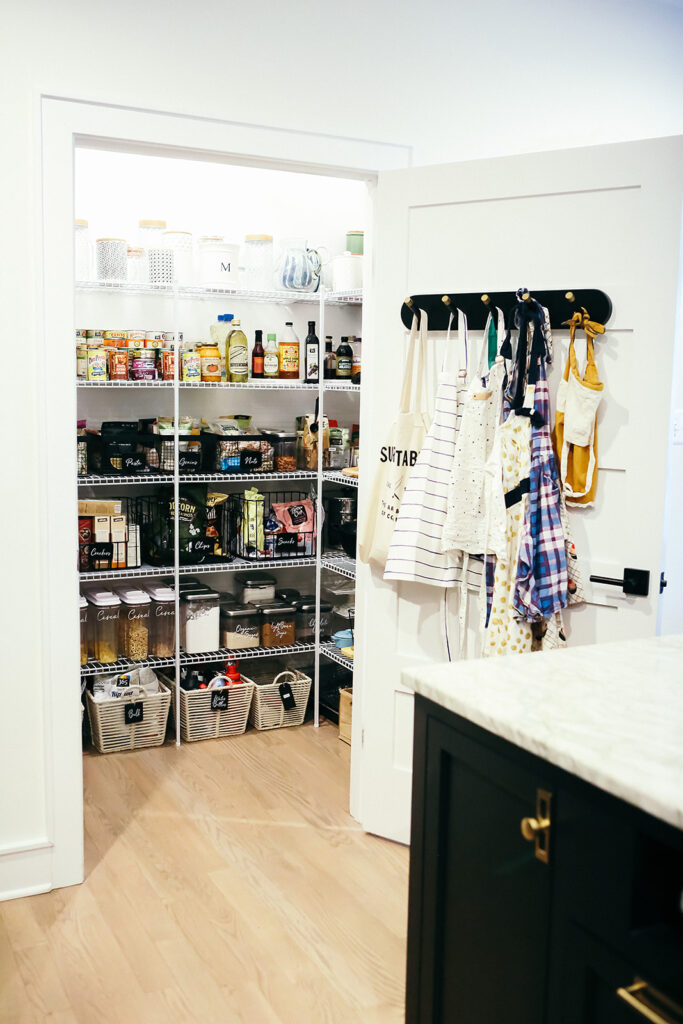
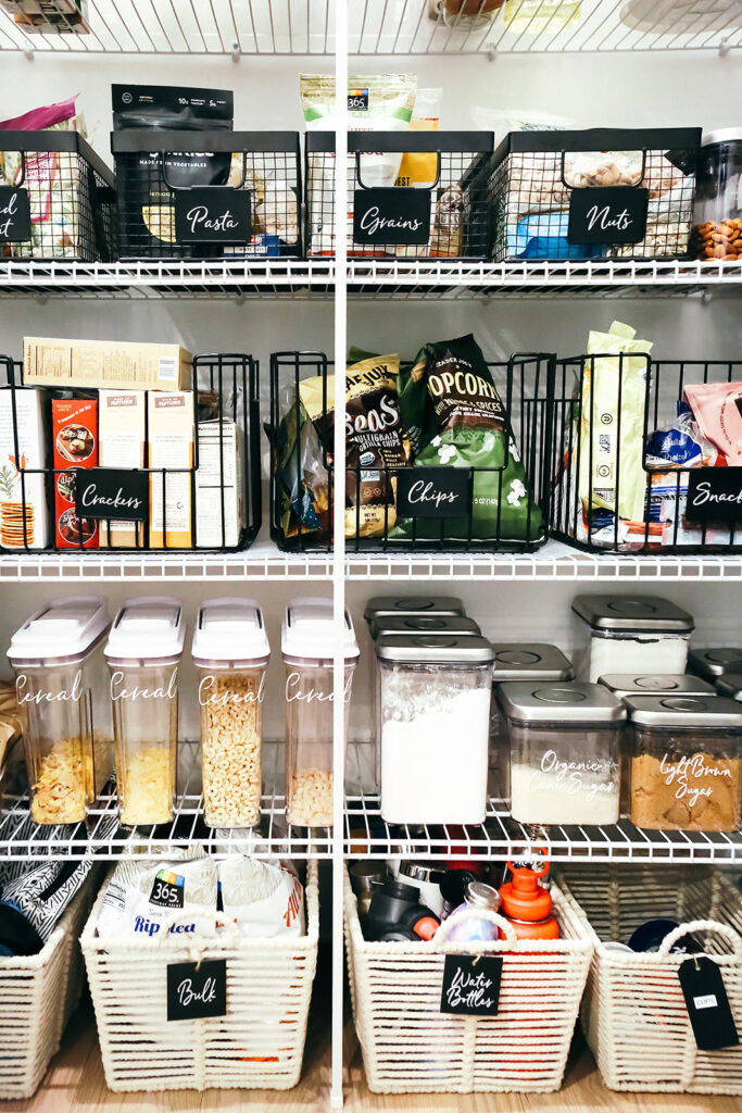
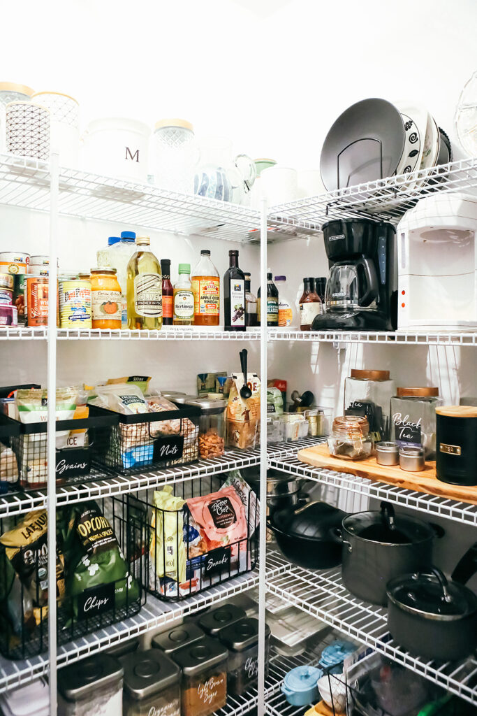
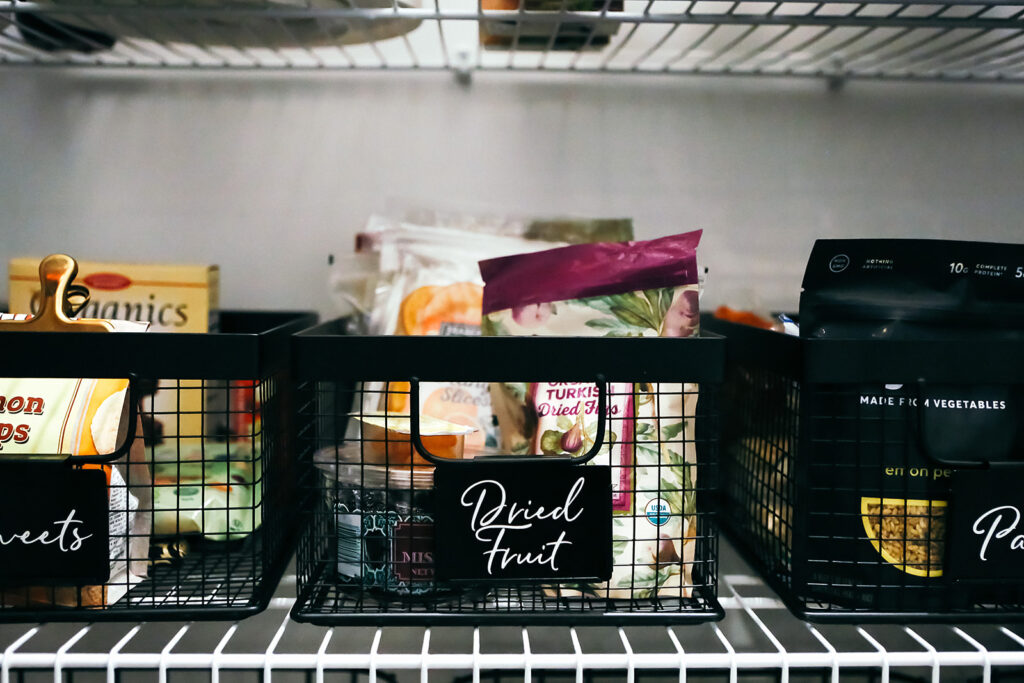
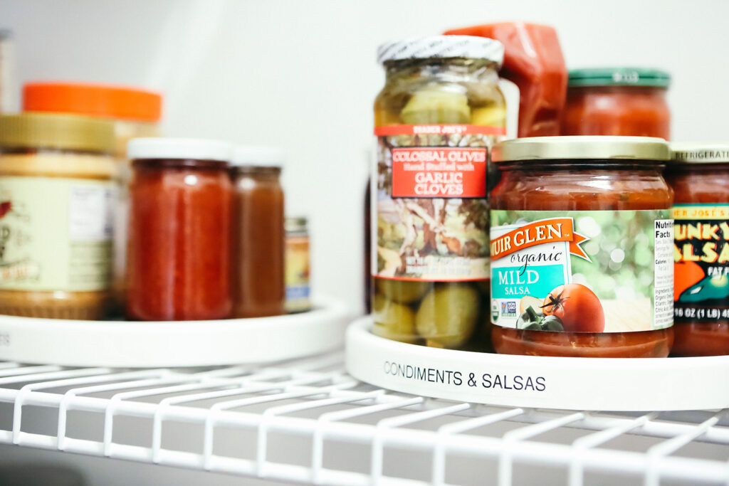
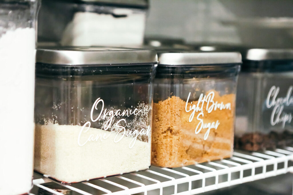
As you can see in the first photo, we coordinated products to match her beautiful kitchen and chose containers with wide bases that would be more stable on the wired shelving. We used a lot of turntables for the same reason. Custom vinyl labels on the Oxo’s and lower bins elevated the whole look.
Phase 2
In phase two, it was time to lose the wire shelving! Kim’s pantry underwent a complete transformation, with all new cabinetry and shelves being installed to provide closed-door storage, but also plenty of room for frequently used items and beautiful serveware on open, wooden shelving.
And that wallpaper! See for yourself below what a master Kim is at selecting the perfect print.

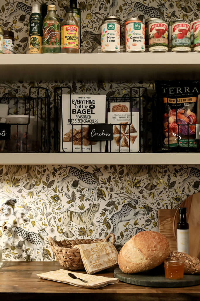
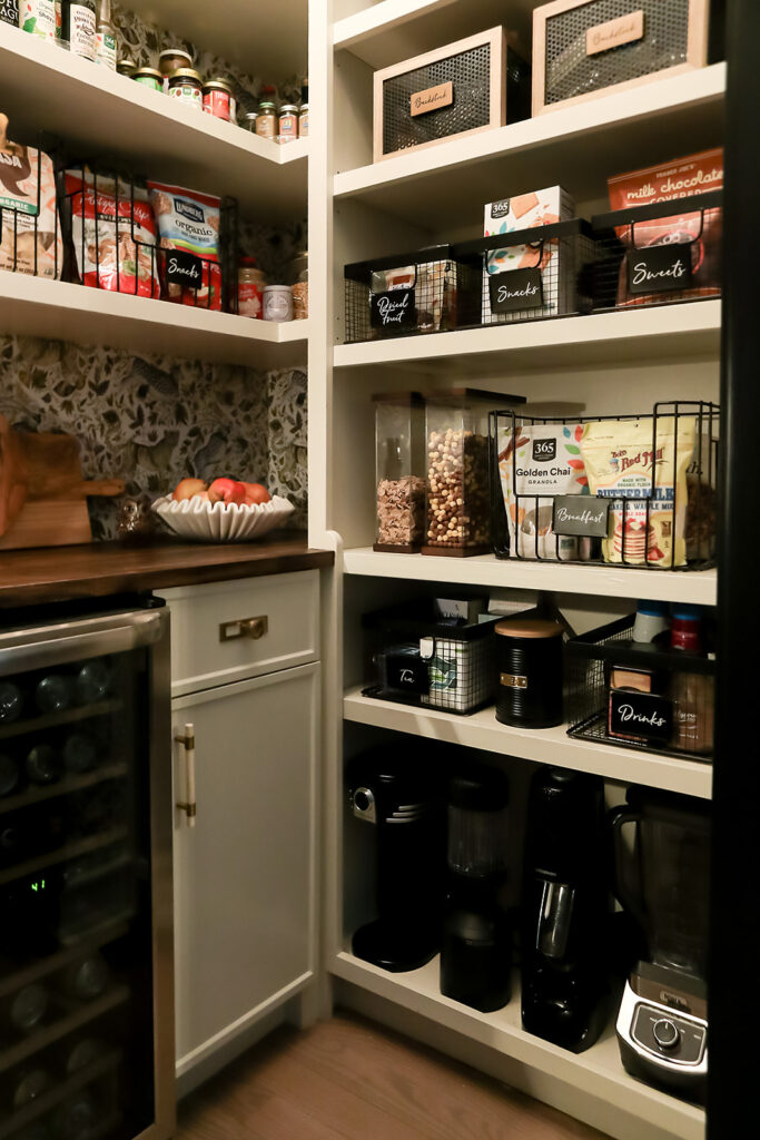
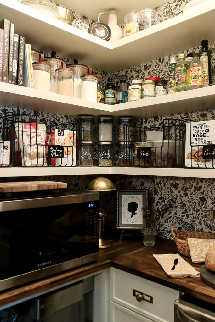
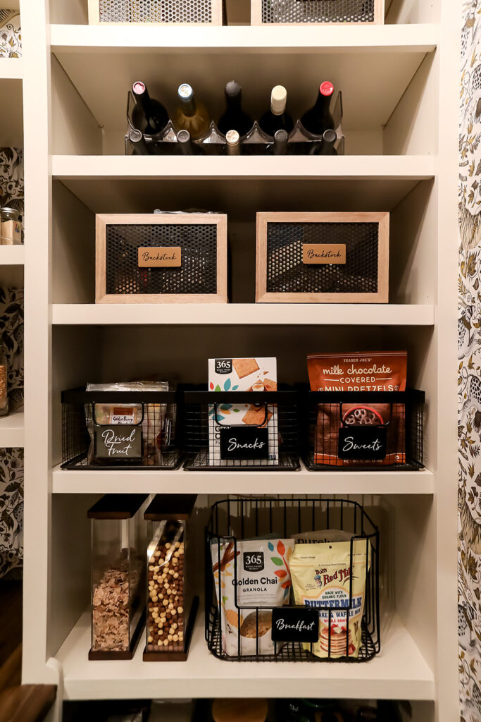
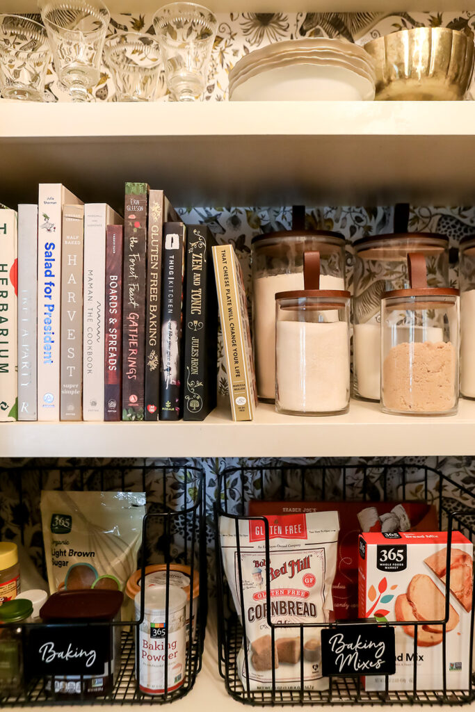
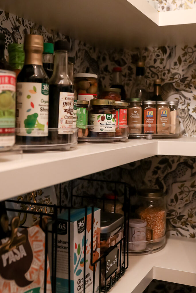
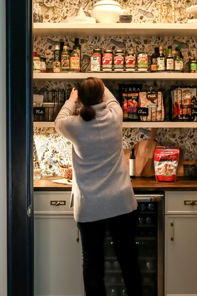
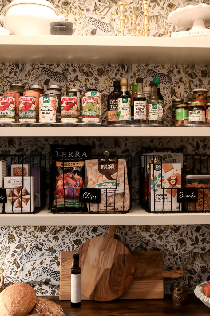
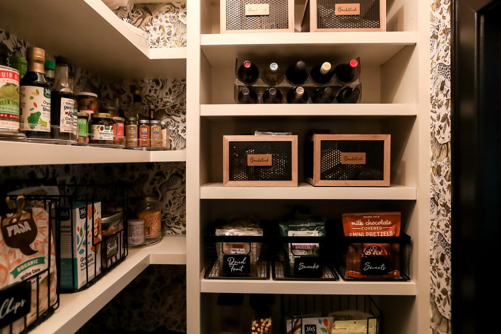
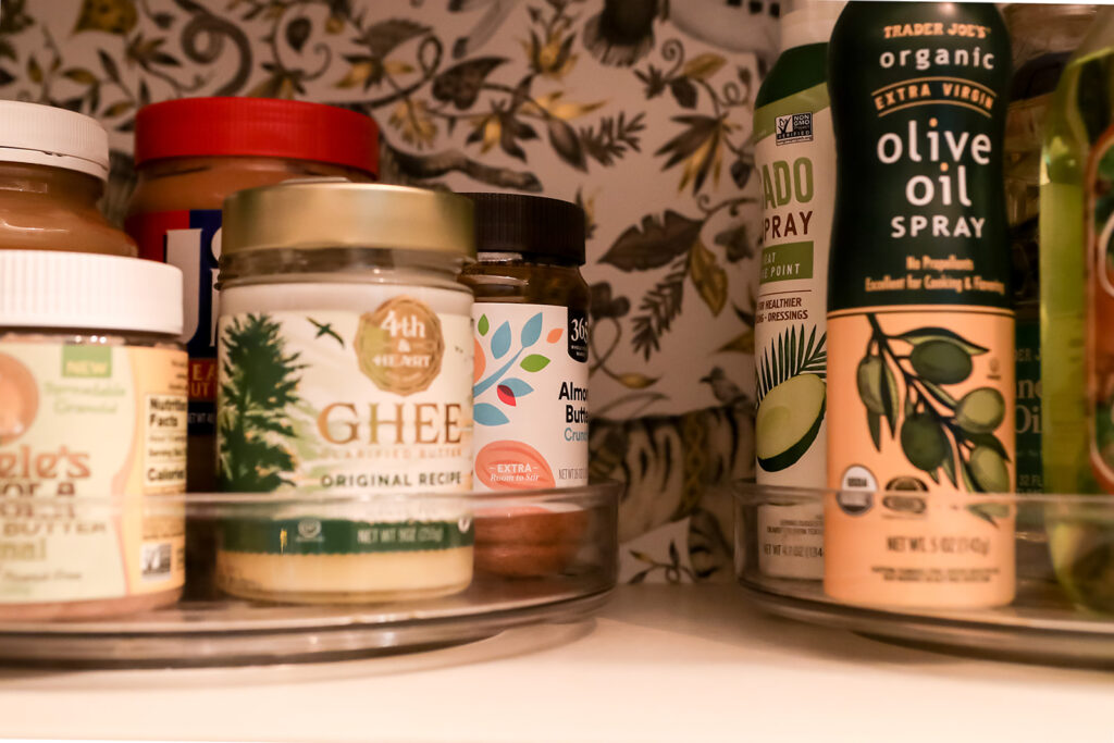
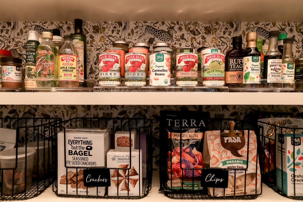
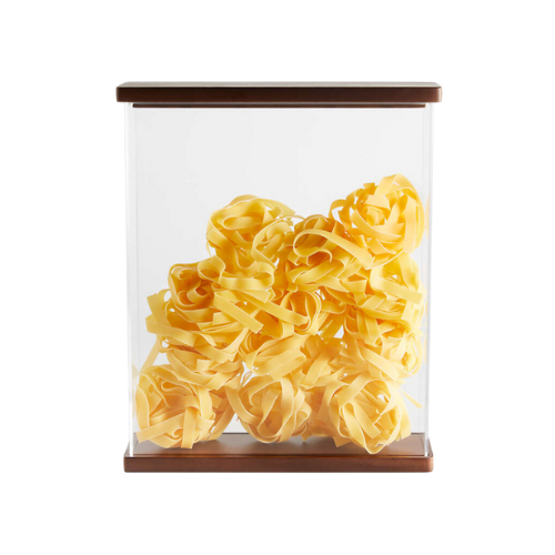
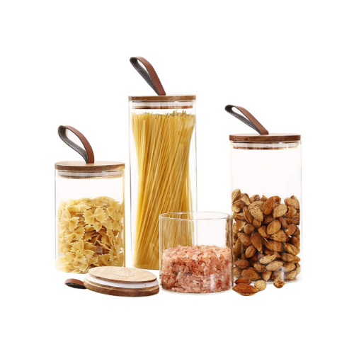
As you can see, we were able to use a lot of the same products in this second project. A few swaps and additions were made to further elevate the look of the pantry. (You can shop the space using the linked photos below. The glass canisters with leather straps were a Homegoods find, but I linked something similar from Amazon.)
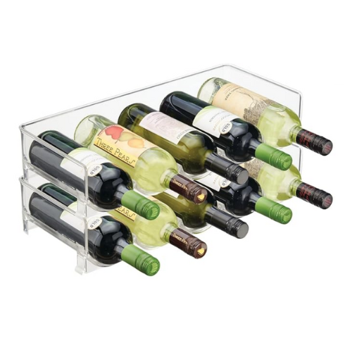
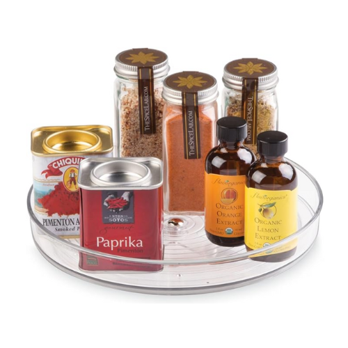
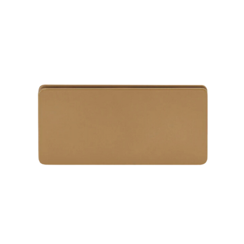
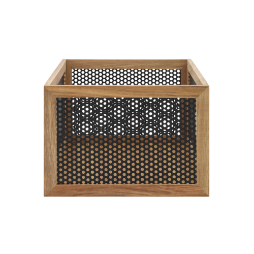
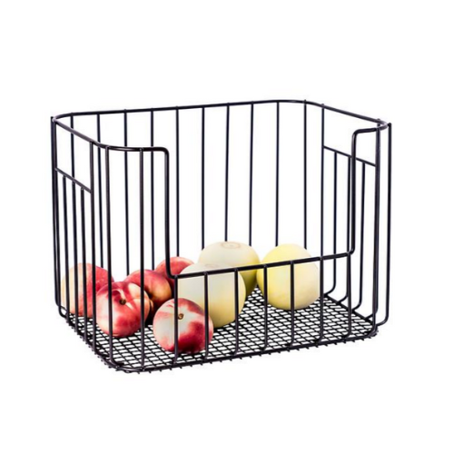
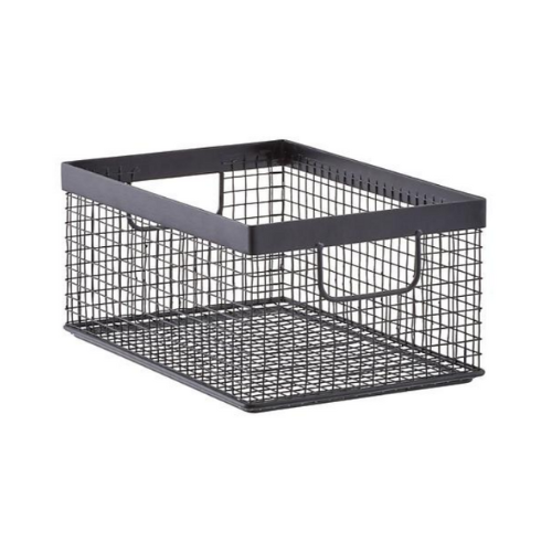
For example, we swapped out the turntables for a clear option and added in some gorgeous new black and bamboo bins from Neat Method, with matching gold labels to really highlight them. We also used mDesign’s bottle organizers for additional wine not stored in the fridge.
Tips from this Pantry
If you have a pantry with corners like this one, I highly recommend using turntables in the corners, which can easily become a place for things to get lost. The lazy susan keeps everything really accessible without wasting space.
Because we worked with Kim from the beginning of this project, we made sure that there was a designated spot just for her small appliances, which can often be a chore to store. They really anchor the bottom of the pantry on the right wall, in a space designed just for them!
We really had a great time working with Kim and her team to style the space, too! In a smaller space, it may not be the most functional option, but if you have the room, I encourage you to show off your favorite pieces and to treat your pantry like you would any other room in your home. Add a lamp, some frames – make it cozy and warm, a place you’ll never mind visiting! (We like to do the same in primary closets, too!)
I hope you’ve loved your tour or Kim’s pantry. Hear from her about her experiences over on our projects page, where you can see a few other spaces we’ve worked on as well.
If you’re in the market for a pantry glow-up and local to the Annapolis/Baltimore region, reach out and get on the schedule. As we approach spring, it’s going to get busy so beat the rush!
Happy organizing!
